I had to go for my annual mammogram and it was made a lot more comfortable by the beautiful design. The Breast Health Center design felt like it high end hotel or spa. It wasn't clinical or cold. I asked who the designer was and the girls working did not know. Shame, I would love to see their web page.
The colors were mainly brown and pink of course with a touch of green. The pink tones went front light to bright and represent the international breast cancer symbol.
The lighting was moody and fun, this picture makes this look a bit funky but it was innovative and pretty in person. The whole acrylic block looked glowing.
This is the changing room that was small but beautiful and had everything a girl would need.
Wall paper that was used throughout.
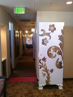
The little dressing rooms are down this hall and then you wait in your spa robe to be called for your state of the art digital mammogram. This pretty cabinet houses extra spa robes. Couldn't you just see buying a plain cabinet like this at IKEA and then stenciling it in an oversize damask pattern and then add white paint! Great IKEA hacker idea! Notice the carpet transitions from stripe to a free form damask interpretation. In the way back they have another pretty crystal chandelier in the ultrasound waiting room.
 |
| you can see the wall paper here |


Very cute. I go on the base and it is bare boobs, bare bones. :)
ReplyDelete